English
  Dutch
Dutch 
Design History
Design is at the heart of everything we create.
We drew from Dutch modernism — especially the De Stijl movement — to craft something honest, minimal, and functional.
Podpop’s form reflects these ideas: reduced to the essential, balanced in shape, and always purposeful.
We drew from Dutch modernism — especially the De Stijl movement — to craft something honest, minimal, and functional.
Podpop’s form reflects these ideas: reduced to the essential, balanced in shape, and always purposeful.

Born over 100 years ago, De Stijl embraced simplicity, balance, and geometric purity.
At podpop, we follow the same path. Clear lines. Primary colors. Structure with intention. Every stitch and surface reflects this heritage — not for decoration, but for meaning.

Our colors
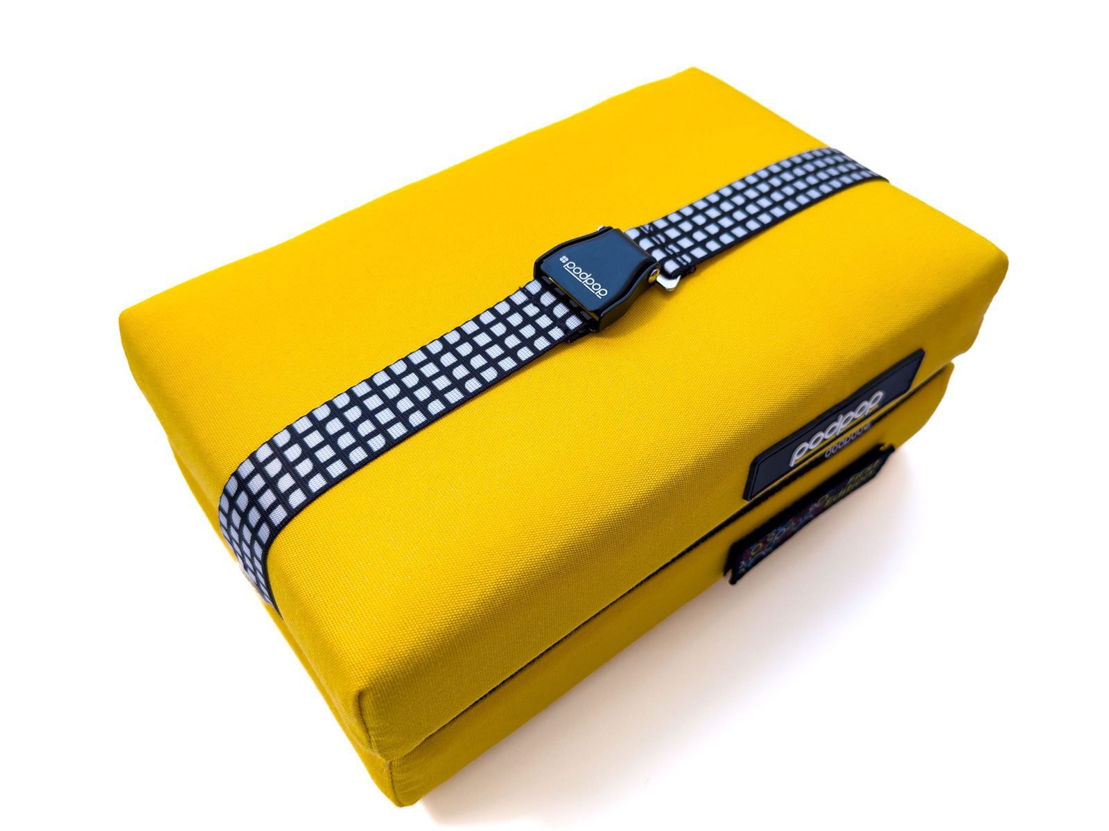
Inspired by De Stijl, our palette centers on primary tones — red, blue, and our signature yellow — balanced with white, black, and gray.
Yellow is the standout: a color of light, energy, and optimism. It reflects what podpop stands for — brightness, clarity, and joy in everyday moments.
These colors also make podpop instantly recognisable while fitting naturally into city and outdoor environments.
Yellow is the standout: a color of light, energy, and optimism. It reflects what podpop stands for — brightness, clarity, and joy in everyday moments.
These colors also make podpop instantly recognisable while fitting naturally into city and outdoor environments.
Yellow
Red
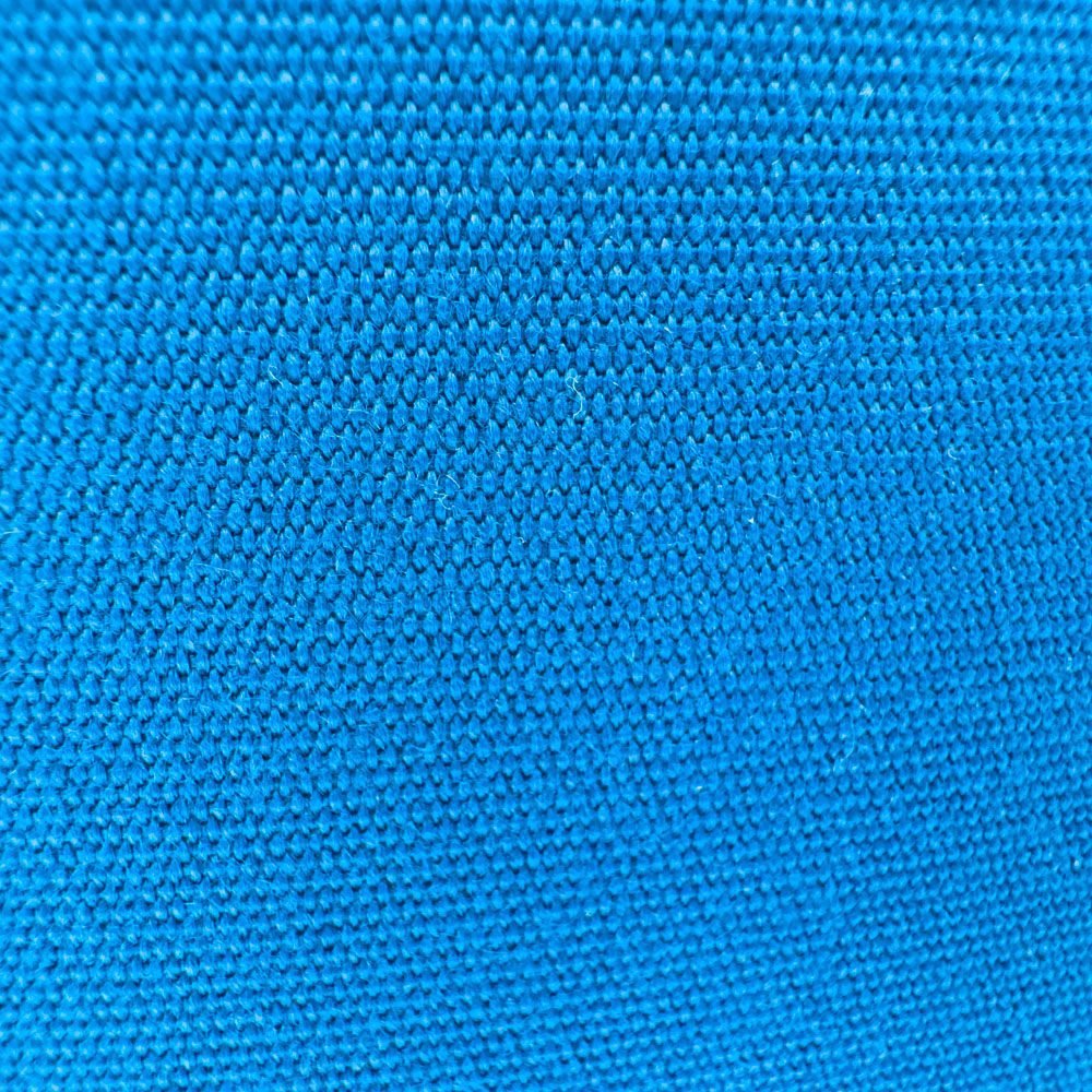
Blue
Our vision
In our pursuit of balance and harmony, we incorporated the golden rectangle.
This concept, with a ratio of around 1.618:1, is celebrated for its aesthetic allure.
This is the reason why the folded shape of podpop adheres to this proportional idea — building calm geometry into a practical object you carry every day.
Our goal is simple: timeless design that improves how you rest outdoors.
Our logo
Our logo reflects the same ideas: clarity, balance, and approachability.
Its bold shape, soft edges, and yellow accent echo our cushion’s form and character.
Its bold shape, soft edges, and yellow accent echo our cushion’s form and character.


This is more than a graphic element — it’s a reminder of thoughtful design, reliable quality, and a product made for everyday outdoor use.
Where does podpop come from?
The name “podpop” blends two ideas:
“Pod” — a compact, self-contained space for calm and comfort.
“Pop” — something vivid, memorable, and bright.
Together, they express our essence: bold simplicity, practical design, and a cushion you will want to carry with you.